Hi everybody. After years of being “HSR Correspondent Dave” and e-mailing Craig et al. whenever I thought of something funny, I have been promoted to “HSR Contributor Dave.” Yay me! As I am currently located at the intersection of Penn State’s, West Virginia’s, Virginia Tech’s, and Maryland’s fan bases, my official title now is “Mid-Maryland Contributor Dave.”
After last week’s experiment in ranking the Big Ten schools’ official seals, I’ve decided to make this a season long activity and evaluate the official seals of each FBS team in turn. This week, we take a look at the seals in my current backyard, the ACC. I was going to post this tomorrow night, but for some reason last night ACC graphic design suddenly became a big deal.
12. MiamiWhat it’s trying to say: We’re on the beach and not in some shitty state like Ohio.
What it’s actually saying: Professor Manatee, Ph.D.Punctuation is the difference between a university that knows its shit and a university that knows it’s shit. Prepositions can help to repair ambiguous sentences. For example, they can be used to determine whether the sentence “Miami has a dirty football program” means “Miami has a program for dirty footballs” or “Miami has a football program that is dirty.”
When I see “GREAT SEAL UNIVERSITY OF MIAMI” with neither an interpunct or the words “OF THE” between “seal” and “university,” I can only conclude that this is the symbol for a university founded and run by manatees. That would explain the poor use of space in the center of the seal, as the manatees are more interested in the bright blue water than in the human symbols of the palm tree, shield, and scroll, which are all way too small.
What it’s trying to say: We’re erudite. And religious.
What it’s actually saying: Dukiana? Jesus H. Christ.
Duke has the most generic Christian seal imaginable, but the use of Latin required the invention of the word “Dukiana” and thus our unending dislike of this seal. Oddly enough, the Latin word “Douchiana” translates into English with two possible meanings: “Red Sox Nation” and “Yankee Nation.”
10. Virginia Tech
What it’s trying to say: We study a broad array of the practical and scientific arts.
What it’s actually saying: You will get a first-rate college party experience here. (Note: the truthfulness of this statement is doubtful.)
If I were an 18-year-old asshole, this is the university seal I would design. We’ve got a shield with a bong on the lower left, a marijuana plant disguised as a corn plant on the lower right, and the end of an MMA bout in the upper left. I’m sure the finger pushing the button on the lamp of learning could be some kind of sexual reference. Of course, if I were an 18-year-old asshole, there are nine ACC schools I’d rather attend than Virginia Tech.
Points were deducted for using a lame sans serif font for the motto “Ut prosim” and for not putting it in a scroll. That’s just lazy design.
9. Florida State
What it’s trying to say: We light the path to learning with our torches representing strength, skill, and character.
What it’s actually saying: Tiki party!
Upon seeing that FSU’s seal consists primarily of three torches, I consulted the NSF and NIH grant databases to see if they had any research collaborations with either West Virginia or Michigan State. I couldn’t find any, but I did find an autism study between FSU and the University of Michigan. Go Blue! Fight autism!
8. North Carolina
What it’s trying to say: We speak Latin!
What it’s actually saying: You better know how to speak Latin too if you want to make it here.
Unlike their archrival Duke, who had to make up a Latin word for its seal, UNC had no such difficulty as Carolina is already the Latinized form of “Charles” and the Romans, as you’d expect, had a word for “north.” Their seal thus has the problem that you actually need to know that “septent” means “north” and not “south” in order to uniquely identify the seal. I think that’s why they use a Carolina Blue version and also several alternate versions where all the words are in English.
The use of V’s instead of U’s is a tad pretentious, but we forgive it because the shield associates the number LVX and hence years ending in 65 with “libertas,” which is a giant ‘fvck yov’ to the lingering racists of N.C.
7. Wake Forest
What it’s trying to say: We’re Baptists!
What it’s actually saying: We have nice cufflinks!
Wake Forest’s seal is a perfectly run-of-the-mill symbol for a university founded by Baptists that maintains its religious character to this day. Points were deducted for not putting a version of their seal larger than 120 x 120 pixels on the Internet, and requiring me to consult a site that sells university-themed cufflinks to find a larger version of the seal to evaluate.
6. Clemson
What it’s trying to say: We’re in South Carolina!
What it’s actually saying: We didn’t put that much thought into symbolizing education on our seal.
Actually not a bad little design. The pillar replacing the trunk of the palmetto tree represents learning, and the hills in the background make it clear this is the primary university in upstate South Carolina (as opposed to those ‘cocks downstate). Points were deducted for the pillar being the only actual reference to education.
5. Maryland
What it’s trying to say: We did quite well when you consider that we constrained ourselves to basing our seal on the state flag. Seriously, you've seen how much worse it could have been.
What it’s actually saying: It’s a Calvert-ball! No wonder every Maryland football game ends with a final score of Q to 12!
You can make it up. If a student is about to graduate summa cum laude from Maryland’s graphic design program, they are offered one special extra examination. They are brought to a special studio where they have access to the most powerful software and the most expensive materials, and they are given one challenge. If they succeed, they are immediately awarded a Ph.D. in graphic design and a job offer at one of the world’s most cutting-edge design firms.
The challenge is straightforward: make something that isn’t ugly using the Maryland flag as the primary design motif. No student has ever succeeded. (Those of you that followed the link will notice that Maryland's Department of Art tries to use the seal design as little as possible on its site.)
4. N.C. State
What it’s trying to say: We commemorate our World War I dead with a large bell tower on campus.
What it’s actually saying: Our campus’s most notable building is a tall erection.
Unlike, oh, say, Michigan State, N.C. State obeys the only rule for putting a campus building on your official seal. That rule is that the building is obviously one that can be found only on your campus, and not a classical colonnade or some other style or architecture that can be found in every liberal arts college in North America.
Designing the seal so that the top of the Memorial Bell Tower sticks outside the circle does show a lack of confidence in one’s manhood, however.
3. Virginia
What it’s trying to say: Surprisingly, nothing about Thomas Jefferson.
What it’s actually saying: Have you seen our alternate seal? It’s the Rotunda - that building was designed by Thomas FUCKING Jefferson! It’s also got 13 stars to symbolize the 13 colonies that joined together and signed the Declaration of Independence, which was written by Thomas FUCKING Jefferson!
Who is this “Minerva” woman on UVa’s seal and what does she have to do with obtaining a classical education? She’s blocking the view of the Rotunda and the dorms. Edgar Allan Poe lived in one of those dorm rooms!
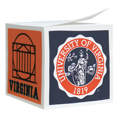
Sarcasm aside, this is actually quite nice. Minerva is one of your go-to symbols of education, and placing her on the most recognizable part of the UVa campus is a good design concept. It’s a shame that the largest version of the seal I could find online was from a post-it note pad available for sale at their bookstore.
2. Georgia Tech
What it’s trying to say: We’re gearheads, and we hate the University of Georgia.
What it’s actually saying: I’m a ramblin’ wreck from Georgia Tech and a heck of a graphic designer.
In 1918, Georgia Tech “borrowed” the center of its seal from the University of Georgia, which couldn’t have been good for calming down the “Clean, Old-Fashioned Hate.” Around that, they added a motto in English (because they’re an engineering school), a gear (again, because they’re an engineering school), and an eternal flame (because they’re Bangles fans).
Having determined that the color scheme of gold and navy would most piss off UGa before designing the seal (not making that up), they fit all that symbolism into a nice, two-color design for a very nice seal.
What it’s trying to say: We’re Jesuits, and we’re in Boston.
What it’s actually saying: We cherish the memory of Mt. Whoredom.
Little known fact: the line spacing in “college-ruled paper” is defined by the spacing between the lines in the background of the B.C. seal.
When you’re a Jesuit college, using Latin on your seal is no longer pretentious and is in fact expected. The symbols on the shield are the classical heraldic symbols of knowledge and the Jesuit order. The chief, or top part, of the shield, recognizes the original Boston in Lincolnshire.
Not knowing the history of Boston, we were confused by the “trimount,” or three hills, on the bottom of the shield. It turns out that, while only Beacon Hill exists today, the city of Boston was originally built on three hills, the other two being called Pemberton Hill and Mt. Whoredom. As we continue our rankings of the seals next week with the SEC, we will keep an eye out for other institutions of higher learning whose official seals explicitly symbolize whoredom. Send comments of love, hate, or erudition to @schnoxl on Twitter.


4 comments:
David, I must disagree on the impossibility of doing something cool with the Maryland flag, because I have seen this effort from their club hockey team:
http://3.bp.blogspot.com/_ofHN_miumNM/TNLj2D-aufI/AAAAAAAABrc/EsGCLRPCyss/s1600/mdgoaliepads.jpg
I'm for keeping 18-year-old assholes far away from everywhere and anywhere.
Quick hits..
I'm biased (towards the "alternate seal", although my UVa ring has Minerva on it), but no shame in losing out to Georgia Tech in this competition.
It figures that BC would be the counterweight to the Fighting Manatees.
It would also make sense that Wake would equal nice cufflinks, being Baylor's more upscale Baptist cousin.
Mt. Whoredom? Talk about a city on a hill...
Post a Comment