And now, HSR Beltway-ish Correspondent David T. with the results of the
Seals of the B1G contest.
12. Ohio State (223
points, mean 3.98, sd 2.13)
What it's trying to say:
???
What it's actually saying:
We need remedial drawing lessons.
I finally understand where THE Ohio State University's obsession with
the the comes from. Four B1G universities include "The" in their seals,
and only OSU sets it apart by using small capitals. They could have
just modified the seal instead of saying "THE" every chance they get.
Voter DEK notes: "It's hard to read, is their slogan now 'Discipline is
lacking'?"
11. Purdue [5 first-place
votes] (256 points, mean 4.57, sd 4.64)
What it's trying to say:
We have a modern spin on the idea of the university seal!
What it's actually saying:
We developed our modern spin in 1969, so we were taking a lot of drugs
when we designed it.
Purdue engineers know their non-Gaussian statistics and thus aren't
surprised to see that the standard deviation of their logo's popularity
is greater than its mean. About 1/4 of you loved the modern take, but
about 1/2 you hated hated hated this seal. In case you're wondering,
that's supposed to be a griffin holding a shield.
10. Wisconsin [1] (261
points, mean 4.66, sd 3.30)
What it's trying to say:
Our eyes are always open for new knowledge.
What it's actually saying:
We must keep Purdue from reaching Mt. Doom and destroying the One Ring.
I had never seen Wisconsin's seal before running the poll. Now I can't
unsee it. And I'm afraid it can't unsee me too. The one-first place
vote came from Greg S., offering further evidence for my theory that he
is actually the Witch-King on Angmar. MLR wants to know if it was
designed by a Hall & Oates fan.
9. Nebraska [1] (297
points, mean 5.30, sd 2.99)
What it's trying to say:
Look at all the cool stuff we do here!
What it's actually saying:
We couldn't think of one symbol that says "university," so we included
all of them.
AFLAC trivia question for the first Nebraska-Purdue game: What B1G
school's official seal contains a train? Matt Millen will be shocked to
learn the answer is Nebraska.
The Nebraska seal is lame in the way that most ads for universities are
lame. Instead of focusing on one or two elements to symbolize the
university, they crammed everything onto the seal and hoped it worked.
Which it didn't.
Voter Emily: "As Coco Chanel once said, a seal should look in the
mirror before leaving the house and take one thing off."
8. Minnesota (301 points,
mean 5.38, sd 2.09)
What it's trying to say:
We've got ALL the arts: science, painting, industry, and woodworking.
What it's actually saying:
We don't so much have a seal as we have a scroll that our regents stuck
on a wall somewhere.
While voters were really split about Purdue, just about everyone agreed
Minnesota (or at least its regents) had the 8th best seal in B1G, with
almost 40% of votes putting it 8th place. DEK: "Minnesota's seal, when
decrypted, is a map to his Lucky Charms."
7. Indiana [1] (352
points, mean 6.29, sd 3.29)
What it's trying to say:
We speak Latin!
What it's actually saying:
We don't care much for font design!
Greg S. noted that Indiana has the words "Lux et Veritas" floating
around a book, when they just as easily could have been
written in the book itself. @jwschultz writes "Indiana: I'd be proud if
you were like a 3-year old university." Voters would have like the seal
better if it used a more classical font.
6. Michigan State [6]
(379 points, mean 6.77, sd 4.29)
What it's trying to say:
We have many lovely buildings on a verdant campus.
What it's actually saying:
We have at least one building on a campus that's verdant because our
seal is green.
Lots of love/hate on the MSU seal. On the one hand, it's pretty enough.
On the other hand, it says nothing about the university other than
"Look! A building!" ecormany liked the "great use of Verdana," perhaps
sarcastically.
5. Illinois (406 points,
mean 7.25, sd 2.49)
What it's trying to say:
We have strong agricultural roots and are hardworking Midwestern folk.
What it's actually saying:
Our books glow for some reason. (possibly involving Peter Graves)
No university in B1G has a bigger contrast between what it's like today
and what its seal claims it's like than Illinois. It's a high-tech
university, the place where both HAL and Dippin' Dots were created, but
the seal holds fast to its 19th century agrarian roots.
@jwschultz: "Illinois, we are serious about learning and we have dead
languages on our emblems. We make up fake Latinized names for our
states and we put serious Latin words on the pages of the books in our
Seals. You don't get to split "AGRICULTURE" onto two lines; go find a
word like "ILLUMINATIO" and you may split it as often as needed."
4. Iowa [1] (408 points,
mean 7.29, sd 2.60)
What it's trying to say:
We have a hawk. With a bow and arrow. That kicks ass.
What it's actually saying:
It's really important you know the exact date we were organized.
Unfortunately we didn't keep record of the time.
They didn't have to try very hard to have a better seal than
IowaState. Dan TrueBlue says it looks like it belongs more on a dollar bill
while Greg S. called it a "rejected tails coin design." Most people
seemed to like the clean design.
3. Northwestern [3] (453
points, mean 7.29, sd 2.92)
What it's trying to say:
We speak Greek! And Latin! and English!
What it's actually saying:
We couldn't decide on a motto. Also, ask about our Sanskrit motto
contest.
With three concentric circles of names of mottoes, Northwestern should
have 6 official seals for each possible permutation of English, Greek,
and Latin. It would be awesome to see Universitas Caurensis or
Argestes. As an engineer, I'm fond of our forefather Vitrivius and his
northwestern wind names.
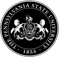
2. Penn State [6] (531
points, mean 9.48, sd 3.45)
What it's trying to say:
We are a university in the state of Pennsylvania.
What it's actually saying:
We were too lazy to come up with our own seal, so we just used the
state's.
Nick called the PSU seal "classy" for looking like an actual seal used
to actually seal letters in wax. Pennsylvania native DEK was livid that
PSU just ripped off the state's official seal - although borrowing the
state's official seal can produce some unusual designs, e.g.,
LSU.
1. Michigan [32] (669
points, mean 11.95, sd 3.73)
What it's trying to say:
Lamp of learning, check. Book, check. Rays of light, check. Arts,
check. Science, check, Truth, check. That's all you'll ever need in a
seal!
What it's actually saying:
We're Michigan. We don't need to do anything original to win.
Michigan won this contest for two reasons: 1) This is a Michigan blog.
2) Michigan's graphic identity people were the only ones smart enough
to make sure the highest-quality version of the seal got put on
Wikipedia.
Bo & Lloyd must like the seal. It's the "three yards &
a cloud of dust" of design. The worst thing about it is that you could
change the name and colors and it would work for any reputable
university.
MVictors linked to the history of the Michigan seal:
http://mvictors.com/?p=3144
Many thanks to David for putting this together and thanks to all of you
who voted. We may do another of these in the future, so we're
open to suggestions.


 10. Iowa State


